What’s Wrong with the Old Design
For starters, it’s old and outdated, and most importantly, it was broken on mobile view layouts. The commit page layout has never been touched after its final design; only minor fixes and changes have been made. The commit page was more developer-friendly than user-friendly (IMO). New users often find themselves struggling to understand what’s being shown on the commit page (me included in the early days). In my opinion, the reason is that everyone is used to GitHub and GitLab, and they both share a similar yet distinguishable user interface. When seeing a different UI choice in Forgejo/Codeberg, it is often difficult to understand the design. Here, an issue was raised to make changes to the commit view table to group the commits by date.
Why I Decided to Work on This
I volunteered to take on this whole revamp during April 2025, when I was being mentored by Tomáš Hrčka, Justin Wheeler, and Akashdeep Dhar as part of my Fedora Fellowship. At first, I brought this topic to Tomáš Hrčka, saying that I wanted to take responsibility for working on the frontend side of things. That’s when he suggested I work on this commit layout issue on Forgejo.
At first, I wanted to work on Fedora’s Forgejo (now called Fedora Forge), but Tomáš Hrčka suggested I work on Forgejo itself since we don’t have many new contributors to work on Forgejo. The changes made to Forgejo will be reflected in Fedora Forge anyway. This decision was clearly beneficial for me because I got the opportunity to connect with Forgejo community members, and I learned how to work on Forgejo with the help of others teaching me.
As time went on, I gotten very active within the Forgejo community, asking for doubts, guidance, feedback, and more.
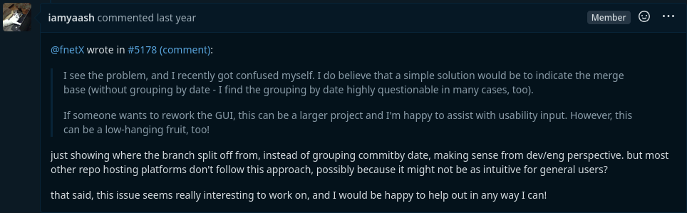
Eventually, I got my hands on the revamp of the new design after making a comment on this issue and started working on it right away!.
What’s Changed in the New Design
I would say it’s a lot, since we revamped the whole UI of the commit page, and we also fixed a couple of bugs while we were at it.
At first, the requirement was to add a feature to order the commits, since the commits list was being rendered inside the table, which made it convenient for adding this commit order functionality. However, this functionality later seemed unnecessary, and after clarifying it with the Forgejo folks on the Matrix channel, we decided to entirely revamp the whole commit list.
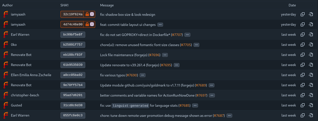
Current Design
Desktop Layout (as of Jun 2026)
Mobile Layout (as of Jun 2026)
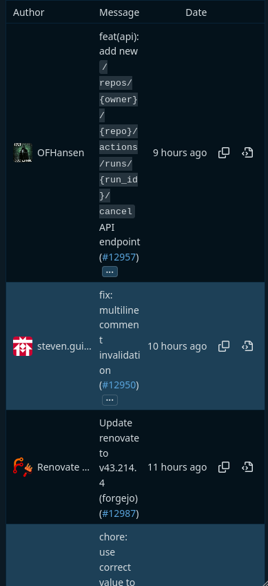
There is almost no proper mobile-responsive CSS written, and the CSS that does exist only helps patch the existing glitches, keeping the layout from breaking or overlapping. The table simply shrinks horizontally when the window size is reduced. Additionally, the SHA box is also lost when the window size is reduced. This is what you see on an iPhone 14 screen.
New Design
Desktop Layout Ideas
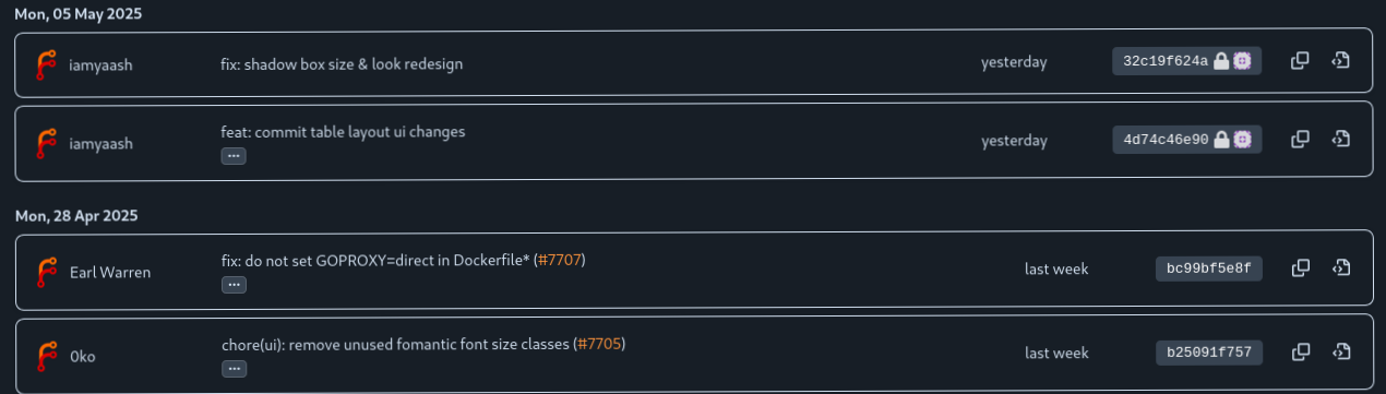
This was the design I thought of in the early phase, grouping the commits by date with each having its own border. Also, I highlighted the SHA box with a solid color instead of the neon theme. Since this is a mock design, it clearly needs improvement, and this design looks a bit not user-friendly.
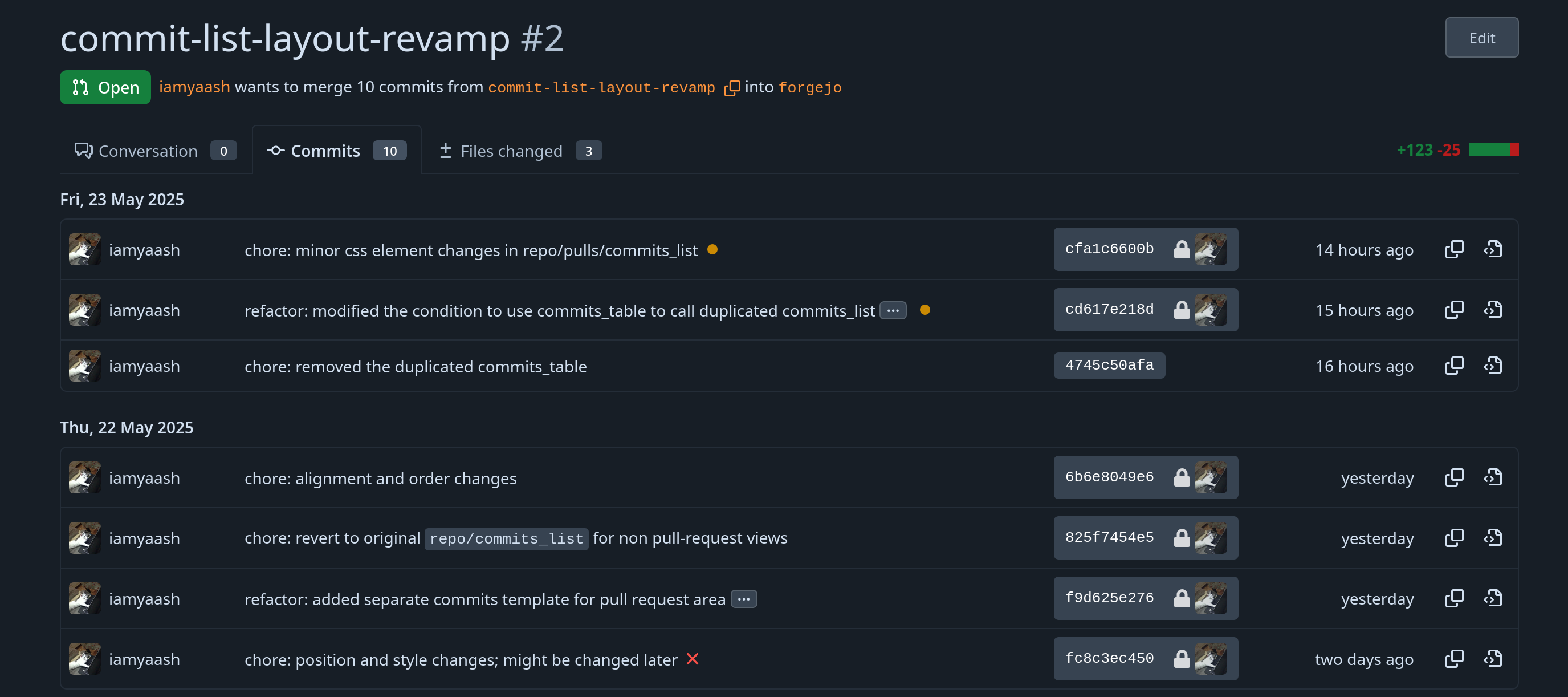
The early design was later refined to make it look nicer, and the placement of elements was also reworked, following what users are comfortable with. This may look fine, but this was hardcoded to show and get a green light to proceed with this design. It is still in the early phase. Also, the SHA box looks a bit thicker and looks odd compared to the other elements in the commit list.
Note: The entire backend was replaced by the time I have made this early design, previously the commit list was being rendered inside the table, however I have rewrite the code with for loops, also it kinda made it easier for me group the commits by date.
Finalized Desktop Layout
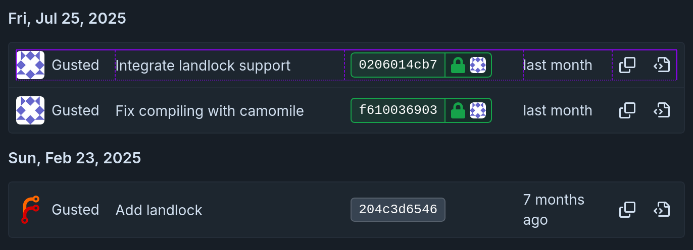
Since I’m relatively new to the Forgejo’s codebase, I was able to come up with the initial design and lay the foundation, but I clearly needed help with the final changes of the revamp. 0ko made sure to assist as much as with this revamp.
Mobile Layout Ideas
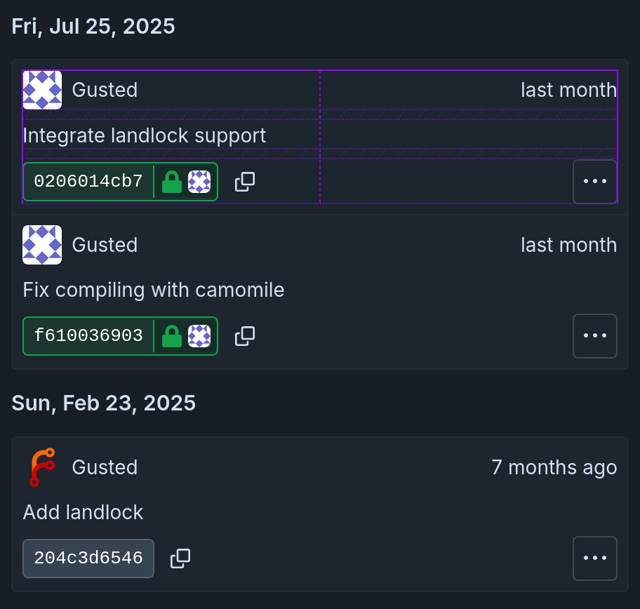
The mobile layout has been fully rewritten from scratch since the existing code was already broken for the previous design. I used tldraw to create a mock design for the new mobile layout, shared it in the PR comments, and received feedback. Then, I started working on a better design that everyone could agree on. Since there was a good amount of engagement on the page, with many people expressing interest in this new design, I received numerous comments and incorporated that feedback to create this final design.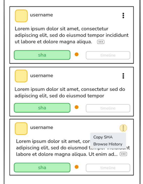
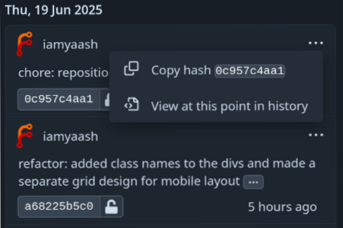
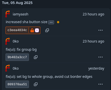
After some trial and error, we got to this design, and I received help from 0ko as well. I almost finished the visual structure of the design, and we needed to make final changes such as SHA box placement, button and ellipsis button placement, and adding a border to highlight them. It took some time to come up with this design, since the mobile layout was completely designed and communicated asynchronously.
Finalized Mobile Layout
Bugs Fixed/Found While Working On This Revamp
I found this while I was writing e2e tests using Playwright. It popped out of nowhere, and it clearly doesn’t make sense. However, it was a not critical bug so I thought that while I am working on this revamp, I might as well fix this bug.
This basically renders the tooltip contents in English only, even though the language was set to something different. So I raised this PR fix: uses lang attribute to set the right language for tippy tooltip #10065 and fixed the issue, but I was stuck on writing the tests for it. Since I was already working on the commit revamp, I thought I should focus on one thing at a time. This is WIP as of now, and I was hoping to get my hands on it soon.
Important Notes
For now, this new layout will only appear on the pull request page. In the future, it will be adopted across all of Forgejo.
This new layout is scheduled to release in v16.0.0
What I’ve Learned
I would say I’ve gotten comfortable writing code in Go, reading the Go codebase, and navigating it easily to find the relevant files. Additionally, I’ve gotten comfortable communicating, reaching out for help without holding back, and continuing to learn.
I also got great help from my mentor, Tomáš Hrčka, who taught me how to understand and write Playwright test code for Forgejo. His help was very important in finishing the new commit list design. Tomáš has been guiding me the right way since I started working on this revamp. His teaching and guidance matched how I learn and write code, which helped me learn, and find the right resources.
Conclusion
This was a great learning experience, both technically and non-technically. I not only got the opportunity to learn Go and Playwright, but I also got the chance to talk with and learn from the Forgejo community. I am now part of the Forgejo team as well, and I represent both the Fedora Project and Forgejo in my open source journey.