Why the UI Change?
Forgejo uses an older commit table layout that may be familiar to developers but can be confusing for general users coming from platforms like GitHub and GitLab. Issue reference.
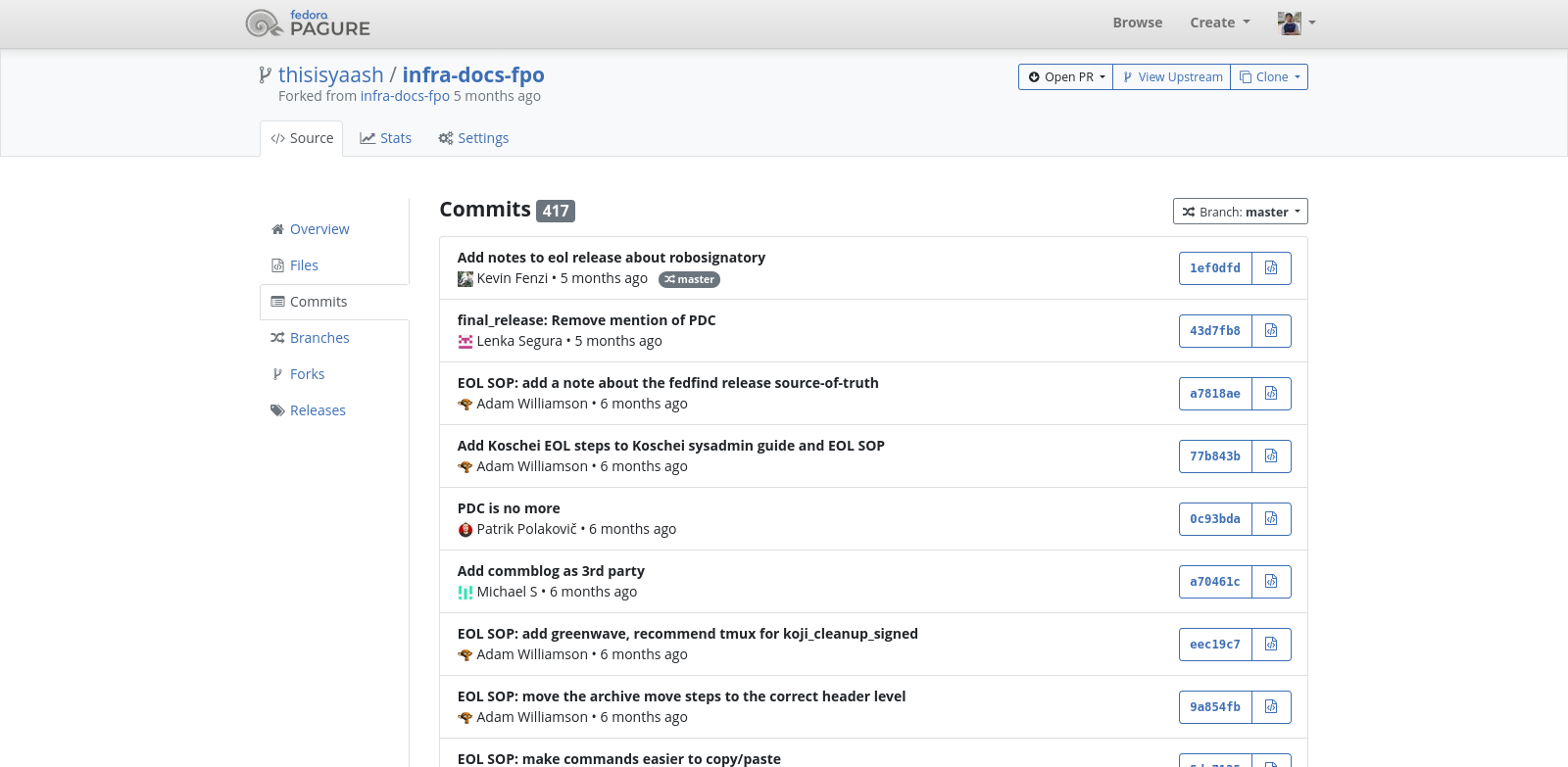
Interestingly, Pagure also uses this same outdated layout. In these older designs, the only way to see when a commit was made is by hovering over the date section to reveal the date and time in a tooltip(popup-overlay). The goal of the new design is to improve clarity by grouping commits by date directly in the interface, eliminating the need to hover just to understand when changes were made. Since we are moving to our new git forge, it’s a better thing to have new feature and UI overhaul than sticking to the old way.
We’re moving from Pagure to Forgejo, and both use the old commit table layout. This is a good chance to update it. Grouping commits by date will make it easier to read and give a better experience, especially for Fedora use cases
Pagure’s Old Table Layout:
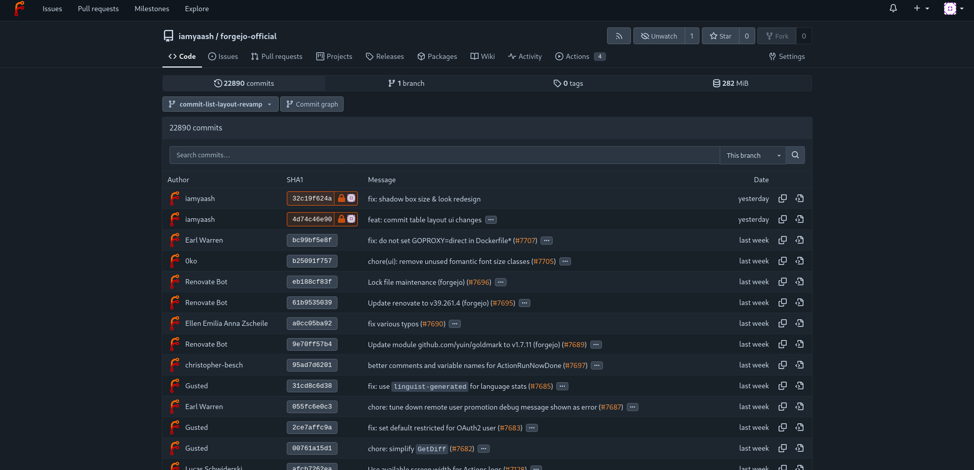
 Forgejo’s Current Table Layout:
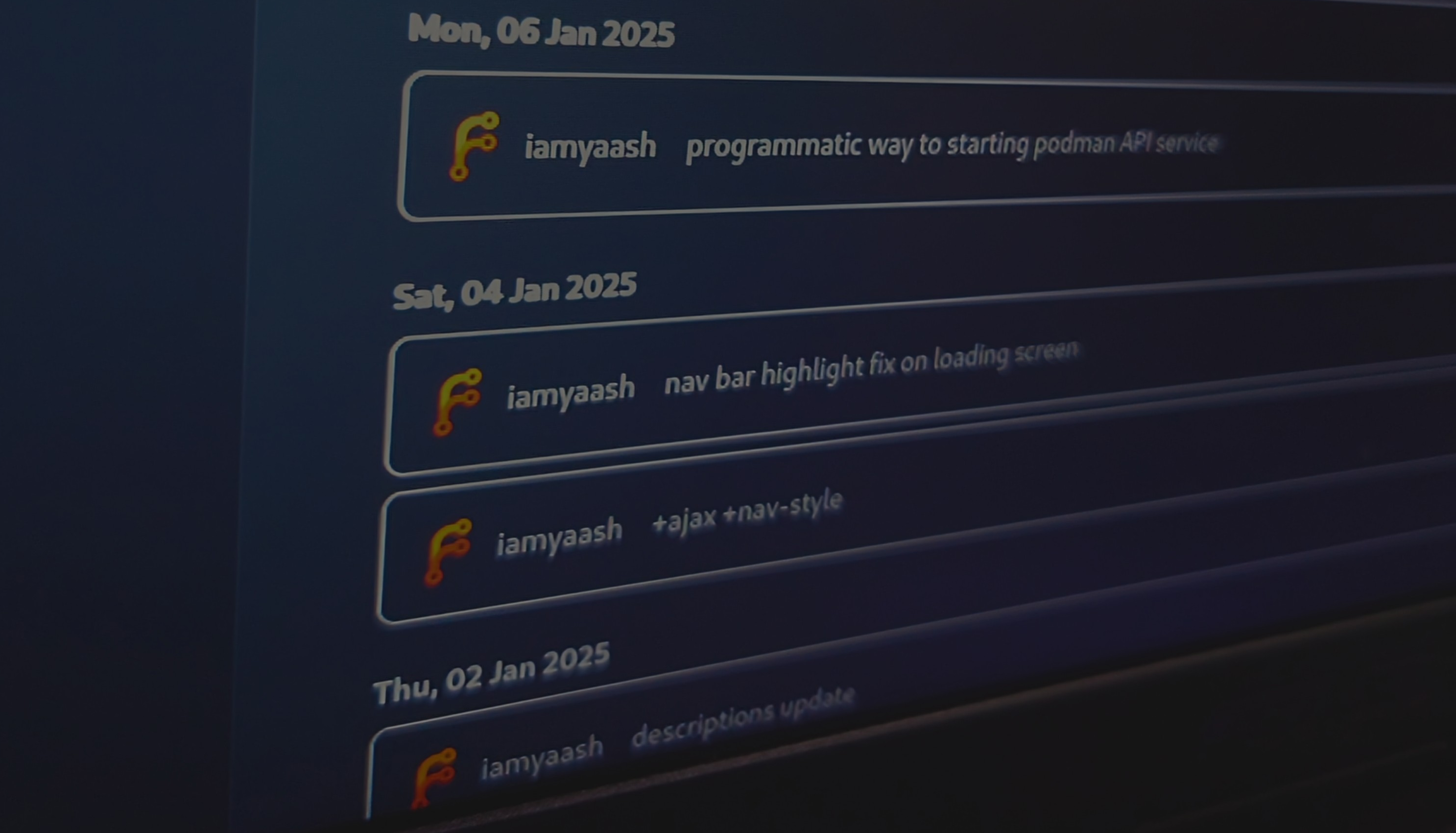
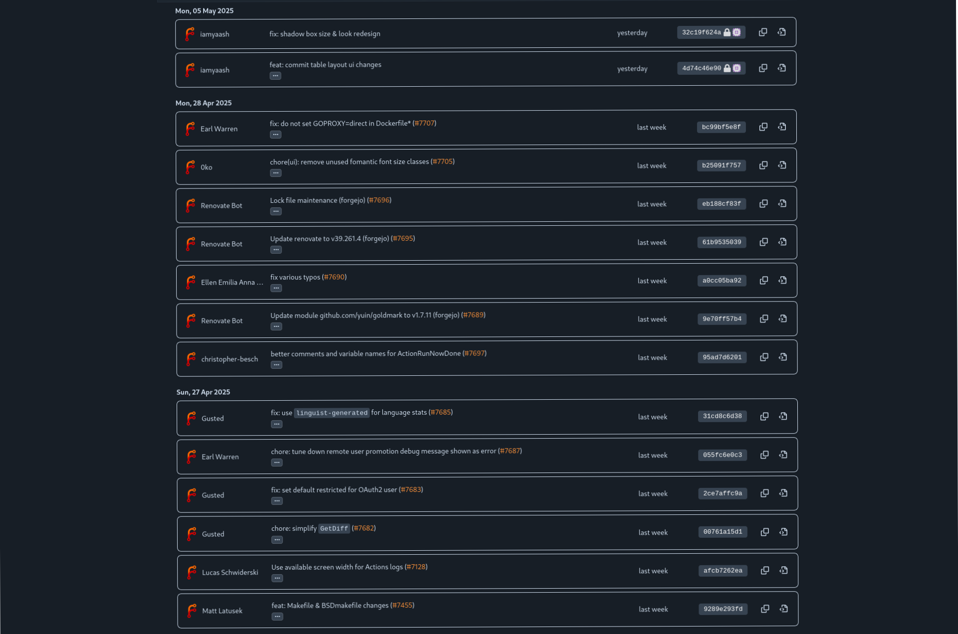
 Forgejo’s Early Stage Design Layout (Proposed):
How I Made the UI Change?
It was quite challenging at first, but I became more comfortable as I continued working on the codebase. Forgejo uses Tailwind CSS for styling, with some parts still using Semantic UI, and it relies on Go templates for rendering. I haven’t touched much of the backend, but on the frontend, the logic is tied to variables passed into templates, which we can use in various fields as needed.
I was basically learning as I went, so the journey was a bit unusual (and maybe even a little messy 🤷🏻♂️).
Identifying the Source File:
To start working on the commit table, the first step was identifying the source file responsible for rendering it. I did this by using the browser’s developer tools to inspect the HTML elements, checking for specific class, and then searching those class names in the codebase. That usually points you to the right file, or at least something close to it—and from there, you can trace your way to the exact source.
A Bit of Learning, A Bit of Researching & a Lot of Experimentation:
I don’t know the Go programming language well, and I haven’t worked on a large project like Forgejo before, so I wasn’t sure how to approach making a UI change.
To get started, I began learning Go to build a foundational understanding of how to write Go code in an Go way. I primarily used Exercism to learn the basics (and I’m still learning). I’m not someone who learns the best by just reading, rather I understand things better by working on them.
So, I started experimenting with the build to see what would happen if I changed certain things. It’s mostly trial and error. I do know some CSS, which helped me understand parts of the UI.
Eventually, I hit a point where I couldn’t make much more progress through experimentation alone. That’s when I started doing more research. Since Forgejo doesn’t have extensive documentation (idk, maybe I was not able to find that 🤷🏻♂️), I referred to Gitea’s documentation instead, since Forgejo is a fork of Gitea, their documentation mostly applies Forgejo too :P
The Logic of How I Implemented the UI Change?
I didn’t build everything from scratch. Most of the changes were made by modifying the existing source code, and I referenced a few parts from other sources as well.
Looping Through Commits (already implemented in the original source)
- The loop gathers information like who made the commit, when it was made, and other related details.
- I added a new section to group commits by date, which gets triggered for each unique date.
Grouping Commits by Date
- If the current commit’s date is different from the previous one:
- It closes the previous date group.
- Then it starts a new section with a label like “Mon, 06 May 2024” (this label is customizable).
- If the current commit’s date is different from the previous one:
Layout and Styling
This part took the most time since it was my first experience working with Tailwind CSS, so there was a lot of trial and error.
- I added borders to each commit to separate them visually.
- Ensured layout spacing for each section to prevent content overflow.
- Some elements are currently hard-coded, but I plan to clean them up as I get more comfortable with Tailwind.
Code (couple of important parts)
- This part checks if the current commit’s date is different from the previous one. If so, it closes the previous group and starts a new date section.
<div class="ui timeline-container tw-relative tw-ml-4 tw-mt-2">
	{{$commitRepoLink := $.RepoLink}}{{if $.CommitRepoLink}}{{$commitRepoLink = $.CommitRepoLink}}{{end}}
	{{$prevDate := ""}}
	{{range .Commits}}
		{{$commitTime := .Committer.When}}
		{{if not $commitTime}}{{$commitTime = .Author.When}}{{end}}
		{{$commitDate := $commitTime.Format "2006-01-02"}}
		{{if ne $commitDate $prevDate}}
			{{if ne $prevDate ""}}</div>{{end}} <!-- close previous group -->
- Each commit is rendered inside a rounded, bordered box with padding and shadow for separation (needs refinement tho).
<div class="commit-list tw-shadow-sm tw-border tw-rounded-lg tw-p-4 tw-mb-2">
    <!-- treated like table, but refactored as flex layout + need some adjustments, might overflow -->
    <div class="tw-flex tw-justify-between tw-items-center tw-gap-4">
        <div class="author">
            <div class="tw-flex">
                {{$userName := .Author.Name}}
What’s Next?
I was only able to create an early design to request feedback from other teams, and I still have more work to do. This is an upstream issue that I’m currently working on. Once it’s merged in upstream, it will be ported to Fedora’s Forgejo instance soon.